
The design of word searches intended for a visually impaired audience relies on typographic and layout choices that go far beyond simple font enlargement. Here, we detail the technical parameters to master in order to produce readable, playable grids that comply with current accessibility requirements.
Contrast Ratio and Paper Choice for Accessible Word Searches
A contrast ratio of less than 4.5:1 between the characters and the background makes the grid unusable for someone with advanced AMD or glaucoma. We recommend aiming for a contrast ratio of at least 7:1 on the printed document, which requires working on two simultaneous axes: ink and substrate.
Glossy coated paper causes glare under direct lighting, a major obstacle for visually impaired individuals who bring the sheet closer to their face. A matte, non-recycled paper (the fibers in recycled paper create a gray background that reduces actual contrast), with a sufficiently dense weight to avoid transparency on the back, is the reference substrate.
On the ink side, pure black on an off-white background (slightly cream) is less straining on the retina than black on bright white. If you use a colored background to distinguish the word list from the grid, maintain the same contrast threshold in each area.
A tool like the Colour Contrast Analyser allows you to check these values before printing, including on PDF exports. Adapting printable word searches for the visually impaired requires this systematic contrast check on the final file, not just on the screen preview.
Typography and Font Size for Large Print Grids
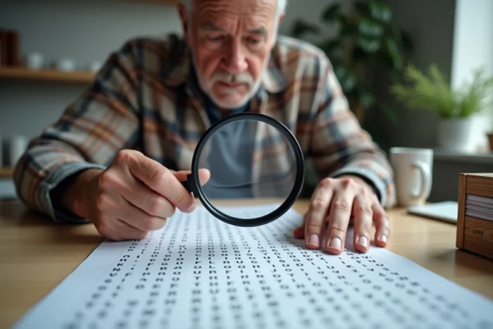
The minimum usable size for a word search grid intended for the visually impaired is around 18 to 20 printed points. Digital accessibility recommendations mention 14 px on desktop and 16 px on mobile, but the transition to print requires increasing these values: the visually impaired reader cannot zoom in on a sheet.
The choice of font affects readability as much as size. Sans-serif fonts (Arial, Verdana, Tiresias) provide better discrimination between similar characters. Three recurring confusions pose problems in word searches:
- The uppercase “I”, lowercase “l”, and the number “1”, which are nearly identical in some fonts. Tiresias LPfont, designed for low vision, addresses this issue.
- The “O” and “0”, often indistinguishable. Prefer a font where the zero is slashed or ovalized, even if the grids do not use numbers (the word list may contain them).
- The “b” and “d”, whose symmetry traps readers with a reduced visual field. An increased letter-spacing mitigates this confusion.
We observe that most online generators (Canva, Educol) do not offer letter-spacing adjustments within the grid itself. Therefore, the file must be exported and manually adjusted in a layout software. A line spacing set to 1.5 times the body size remains the reference value for separating lines without wasting available space.
Grid Dimensions and Letter Density per Line
Enlarging the font without reducing the grid results in a multi-page document that is difficult to handle. The central technical constraint is to find the balance between character size and the number of boxes.
On an A4 portrait format, with 15 mm margins and a 20-point font, a grid of 10 x 10 boxes maximum remains comfortable. Beyond that, the letters become cramped or the grid overflows. Commercial collections intended for the visually impaired also adopt this reduced format, sometimes even 8 x 8.
Reducing the grid requires limiting the number of hidden words. Five to eight words per grid are sufficient to maintain interest without saturating the space. Long words (more than eight letters) complicate placement and force compromises on spacing. It is better to select words of four to seven letters and compensate by varying the insertion directions (horizontal, vertical, only downward diagonal, as upward diagonals are harder to spot for a low vision reader).
PDF Accessibility Compliance for Printables

The upcoming RGAA 5, aligned with the European Accessibility Act, will expand its scope to office documents and not just websites. For word searches generated via a digital interface and then exported to PDF, this means that the readability of the document itself becomes a compliance issue.
Specifically, an accessible PDF of word searches must include:
- Semantic markup: the title of the grid, the list of words to find, and the grid itself must be identifiable by a screen reader, even if the primary use is printing.
- A selectable text: grids exported as images (JPEG, PNG) are not accessible. The vector format or actual text in the PDF allows a user to enlarge the document without pixelation.
- Language metadata: the PDF must declare its language so that voice assistance tools pronounce the letters correctly.
Public generators generally do not produce compliant PDFs. We recommend exporting the grid from the generator, then reworking it in a PDF editor capable of adding markup (Adobe Acrobat Pro, PAC 2024 for verification).
Word List and Cognitive Load
The list of words to search for deserves as much attention as the grid. Placing this list below the grid, in a single column, with the same font and size as the letters in the grid, prevents the player from constantly switching between two distant visual areas.
Each found word should be able to be checked or crossed off directly on the list. Providing a checkbox of sufficient size (at least 5 mm on each side) to the left of each word facilitates tracking progress. This ergonomic detail reduces visual fatigue during game sessions that, for a visually impaired audience, often last longer than for a standard reader.
Limiting the vocabulary to common words with unambiguous spelling (avoiding homophones, hyphenated words) reduces cognitive load and refocuses the effort on visual search, which is already the main challenge for this audience.